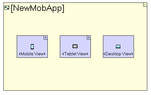
Hi,Have a query on advice on ways to make a Tersus web application developed using the Blank View template mobile responsive on browser onmobile devices (ie display components scales appropriately across display on smart phones and tablets)Understand that it can be done quite easily using the New Mobile Application template. However, there are two issueswhich in my opinion makes me prefer using the Blank View template1) Query raised by me previously http://web.tersus.com/?Id=8020 It seems the UI coding in New Mobile Application template is different to that of Blank View template. As have started using the Blank View template to develop web applications, find it more familiar and easier to code the UI2) In the New Mobile Application template we need to code three times for an application (as seen below, one for <Mobile View>, one for <Tablet View> and one for <Desktop View>)
Above are my opinions/perceptions, hope to be get some advice/comment for the above.Thanks
CheersCliff
To use the full functionality of this web site, JavaScript needs to be turned on.
For best results, use the Firefox browser..
Copyright © 2003-2025 - Tersus Software Ltd., All rights reserved. Terms of Use License Graphic design by EmaraDesign