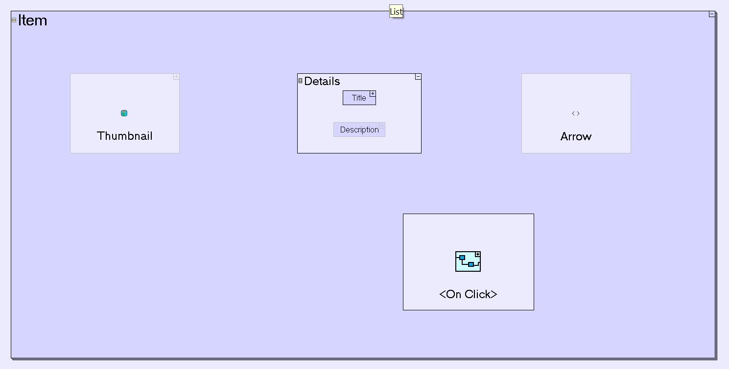
List Item is the most commonly used element within a List.
It models a single row in the list, and by default it contains the following elements:
- Thumbnail - The item's icon (an Image) [note that by default this element has a grey border, indicating it is not created unless initiated by some flow into it; to change this behavior, right click the element and check its Always Create property.]
- Details - Details of the item (a multi-element cloumn):
- Title - The item's name (a Text Display with big font)
- Description - Additional description of the item (a second Text Display)
- Arrow - The > symbol (to be used when the user should click the row to invoke some action) [also has a grey border, indicating it is not created unless initiated by some flow into it; to change this behavior and make the > symbol appear unconditionally, right click the element and check its Always Create property.]
- <On Click> - an action which implements whatever you want to do when the item is clicked. If the item is not clickable, you can delete both Arrow and <On Click>.
Sample mobile modeling: Guestbook:

Which results:
